Jan 16, 2015 Wordpress Development
DIVERSIFYING YOUR WEBSITE TO BE COMPATIBLE ACROSS MULTIPLE DEVICES
With the growing diversity in devices used to access the Internet, the most challenging aspect of website development is building a website that works in perfect unison with all the major operating systems and devices. If your website looks great on desktop systems but looks oddly out of place on iPhones and Androids, you have a perfect recipe for disaster right in your hands, and the sooner you do something about it, the lesser will be the consequences.

Source : Thinkwithgoogle.com
With such far-ranging Internet audience in terms of the devices, it has become imperative for businesses trying to reach out to their customers via the web to adapt. The focus has to be narrowed and the stratagem has to be made even more comprehensive. Keeping in lieu the same, different terms have started bouncing around the walls lately. Responsive designs and made-for-mobile websites are now increasingly been heard since the focus is shifting more and more on addressing all types of devices.
Here is why you need a website that works well across multiple devices:
Mobile Users are Expanding by the Minute
You don’t need to be a marketing or digital guru to know this for a fact that Smartphones have invaded the market. There is no bar in terms of age or purchasing power, everybody is pursuing to own a Smartphone wherefrom they can work on the move, stay connected to friends, family and colleagues and so on. As a website owner, you thus have to make sure that your website, which recieves a heavy chunk of visits from mobile devices as it does from desktops, adapts itself well to the smaller screen sizes. If you aren’t entirely convinced, here are the figurative findings of the Smart Insights for your due consideration:
– One-fifth of total Google searches are made from mobile browsers
2013 witnessed more than 50% of local searches made from mobile browsers.
– More than 60% people have a good feedback to give about the brands that offer good mobile-browsing experience.
– Close to 30% people access their emails on their mobile phones.
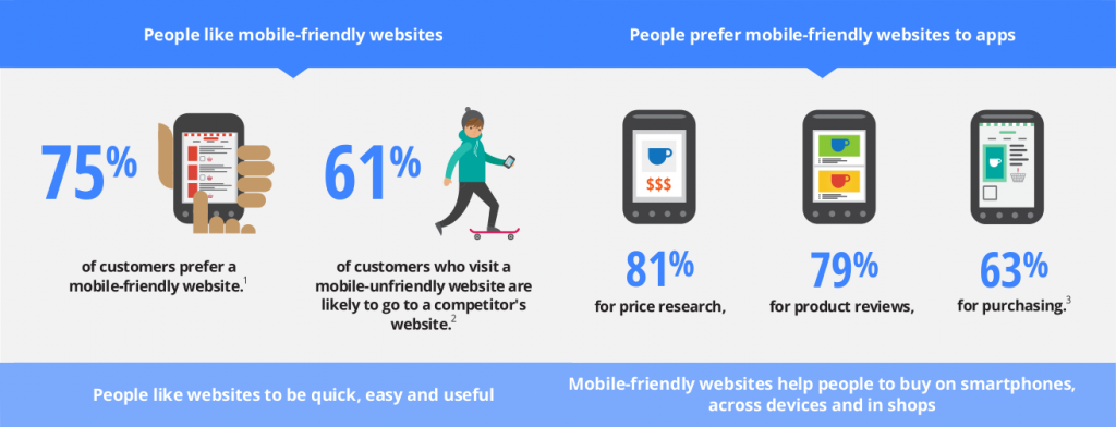
Image Source : Google.co.uk/
User Experience Above Everything Else
Gloss and extravagance no more work in the manner you want them to. Everything boils down to how good or bad is the user experience with your website. And the biggest measure to the UX of your website is how compatible it is with different devices and how fast it loads on the user’s browser.
Ways to Ensure a Multiple-Device-Friendly Website
There are more than one highly potent ways for you to deliver a website that works fine across several devices:
– Build Responsive Web Designs
Go for responsive web designs that ensure optimized website experience, irrespective of the screen size or operating system of the end users, the touch screen feature should work compatibly with the website and users should find your site more accessible and shareable.
– Build a Separate Mobile Website
Building separate mobile sites has also been a practice often followed by brands. Via this approach, the browser is responsible for detecting if the user is accessing web from a mobile device. If yes, they are redirected to the mobile version.
– Go for Dynamic Serving
You can also create a website that works across several devices by using dynamic serving. Here, your website has the same URL on different websites, but the HTML differs. Again, webserver detects the device type and accordingly, it sends across a custom page. So, you can have a website that displays finely on Smartphones, desktops, TV sets and so on. All that is needed is a little code customization by a coding expert.
How Baines and Ernst Serves to be The Most Perfect Example
Baines and Ernst is a seasoned player in the debt industry, having been in the reckoning from close to 2 decades now. They already had a widespread online presence to represent their brand to a wide band of audience but they were yet to take the plunge into mobile Internet till late 2011. This is the period when they woke up to the growing popularity of mobile phones and and the fact that the popularity was here to stay. Of course, the realization came via their Google Analytics report that suggested that a large portion of their users came from the mobile devices.
By the mid of 2012, Baines and Ernst launched their mobile-optimized site and they did see the results fairly improving. Yet, there was a constant tab kept on the user feedback and the incoming numbers. With the financial products involved a lot of intricacy, they needed their website to cut through all platforms, display information with equal ease on all devices, and yet not flood their users with too much.
This is when they embraced responsive web design, as it gave them a way to present their information to the customer in a way that it becomes accessible and visible across any screen, without them having to go to a separate mobile version of the website. The RWD approach has helped Baines and Ernst get rid of the hassles associated with managing multiple sites and yet have a website that offers equally good experience to users, irrespective of what device they are on. They experienced more than 10% growth in pages browsed per visit and the duration of visits from mobiles went up as high a 30%. but the most encouraging stat for the enterprise is the 51% increase in mobile conversion since their responsive web design made its foray.
Wrapping Up
The importance of making your website compatible across multiple devices cannot be overstated. And once you have got a solid slant towards this endeavor, make sure you are making all the right moves.
(Are you finding our posts interesting for a while. Subscribe Now! And we will keep you updated with latest updates. And if you need any assistance with your PSD to responsive WordPress theme, talk to our WordPress developers today!)